Some months ago we created new tag bubble and word cloud visualisations, giving you new ways to summarise and explore the stories people are sharing.
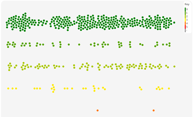
We thought it was time to add another visualisation, and here it is! We're calling it a "story swarm" and it looks a bit like this:
The story swarm is easy to understand - each dot is a story. They are shown horizontally by time, and coloured in this swarm by the criticality of the story. You can also colour the dots according to the progress of the story (unheard, heard, read, response, change).
You can separate the dots, as above, or have them all mushed together.
And of course, like any of our visualisations, you can filter to any set of services, conditions, tags and so on in your subscription.
How to make a story swarm
Follow the same steps as always!
1: Login to your subscription (and stay in subscriber view)..
2: Do a search. How about stories about food or drink?
3: Click the [Save my search as...] button to see your save options.
4: Selection the visualisation tab.
5: Scroll down to the Story swarm visualisation and click the [Preview] button.
6: Explore your visualisation!
As usual, this is just the preview. To share your visualisation, so others can see it, give it a name and description and click [Save and share].
You'll find your visualisation saved in your saved things page. Here's one I made earlier.
Now explore your stories
The visualisation is a visual overview. But it also a way to explore.
- Hover your mouse over a dot to see more information.
- Click a dot to show the story below the visualisation.
- Double-click a dot to open the story in a new tab.
Happy swarming!
Hello story swarm!
Hello story swarm! https://careopinionuk-staging.azurewebsites.net/resources/blog-resources/27-images/69cfd622980643afb53f3555e5296934.png Care Opinion 0114 281 6256 https://www.careopinion.org.uk /content/uk/logos/co-header-logo-2020-default.pngUpdate from Care Opinion tech
Posted by James Munro, Chief executive, Care Opinion, on
Thanks for your feedback.

